Global Housing Affordability

Data Visualization
Visualizing global housing inequality through borrowing patterns
Role
Data Analyst
Team
4 Data Analysts
Duration
5 weeks
Tools
R, ggplot
The Problem
How do you make 200,000 international loan records tell a human story about housing affordability? Raw synthetic data from Kaggle showed patterns, but we needed visualizations that revealed why India and Singapore both face high loan burdens despite operating at opposite economic extremes
Analysis Approach
Exploratory Analysis
200K records, 13 countries
Discovered 3 distinct income groups
Explanatory Visualizations
5 visualization types tested
Tile plots revealed borrowing patterns by income level
Iterative Refinement
Multiple Drafts Per Visual
Global bins showed inequality better than country-specific
Visualizations & Design Decisions
1. Deviation Bar Chart
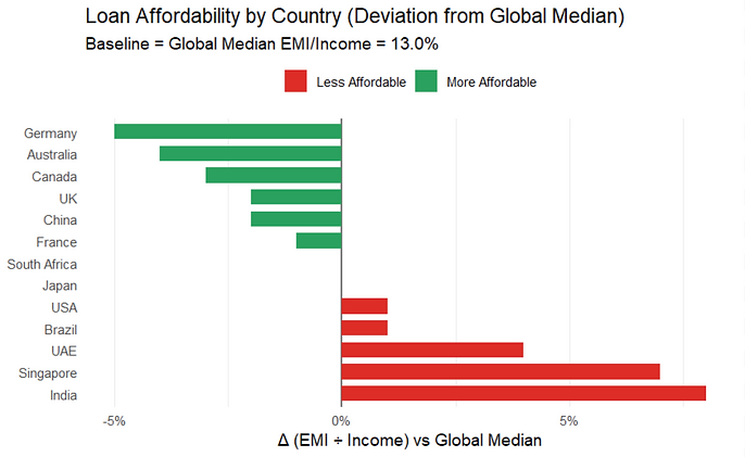
This plot highlights the home loan culture in different countries, answering the question, how much of a person’s income is dedicated to loan repayment in each country?
Why this works: Immediately shows Germany = most affordable, India = least
2. Salary vs. Loan Tile Plot

This tile heatmap shows borrowing patterns across 13 countries by displaying the number of borrowers in each salary-loan combination.
Why this works: Reveals India's concentration in lowest categories vs. Singapore's spread
3. Average Loan Tenure Tile Plot

The visual answers the question, “How does the average loan tenure vary across countries and property value ranges?”.
Why this works: Shows India/South Africa's longer repayment vs. UAE/Canada's shorter
Key Findings
Income groups cluster.
Most countries fell into high-income brackets, but India operated in a completely different range.
Loan burden ≠ loan size
India's small loans created the highest payment-to-income ratio due to low incomes.
Property type barely matters.
Satisfaction stayed equal across housing types. Location and affordability drive happiness, not apartment vs. house.
Reflection
This project taught me that visualization choices are research decisions. When I first used country-specific salary bins, it masked the inequality story entirely, every country looked evenly distributed within its own range. Switching to global bins completely changed what the data revealed. Next time, I'd create both versions early and test with fresh eyes to see which tells the clearer story.